Husqvarna Automower
Connect
Designing a connected mower experience for professionals and consumers alike — a multi-year effort to unify physical HMI and mobile app into one cohesive system.
A system built for the real world
This project involved the long-term design and evolution of Husqvarna's connected product ecosystem, spanning autonomous lawn mowers, physical interfaces, and mobile applications.
The work focused on creating a cohesive, scalable interaction model that could function reliably across different devices, environments, and user skill levels — from first-time homeowners to professional groundskeepers.
Creating a unified experience for outdoor robotics
Designing for outdoor robotics presented unique constraints beyond typical screen design — hardware, environment, and a wildly varied user base had to be addressed simultaneously.
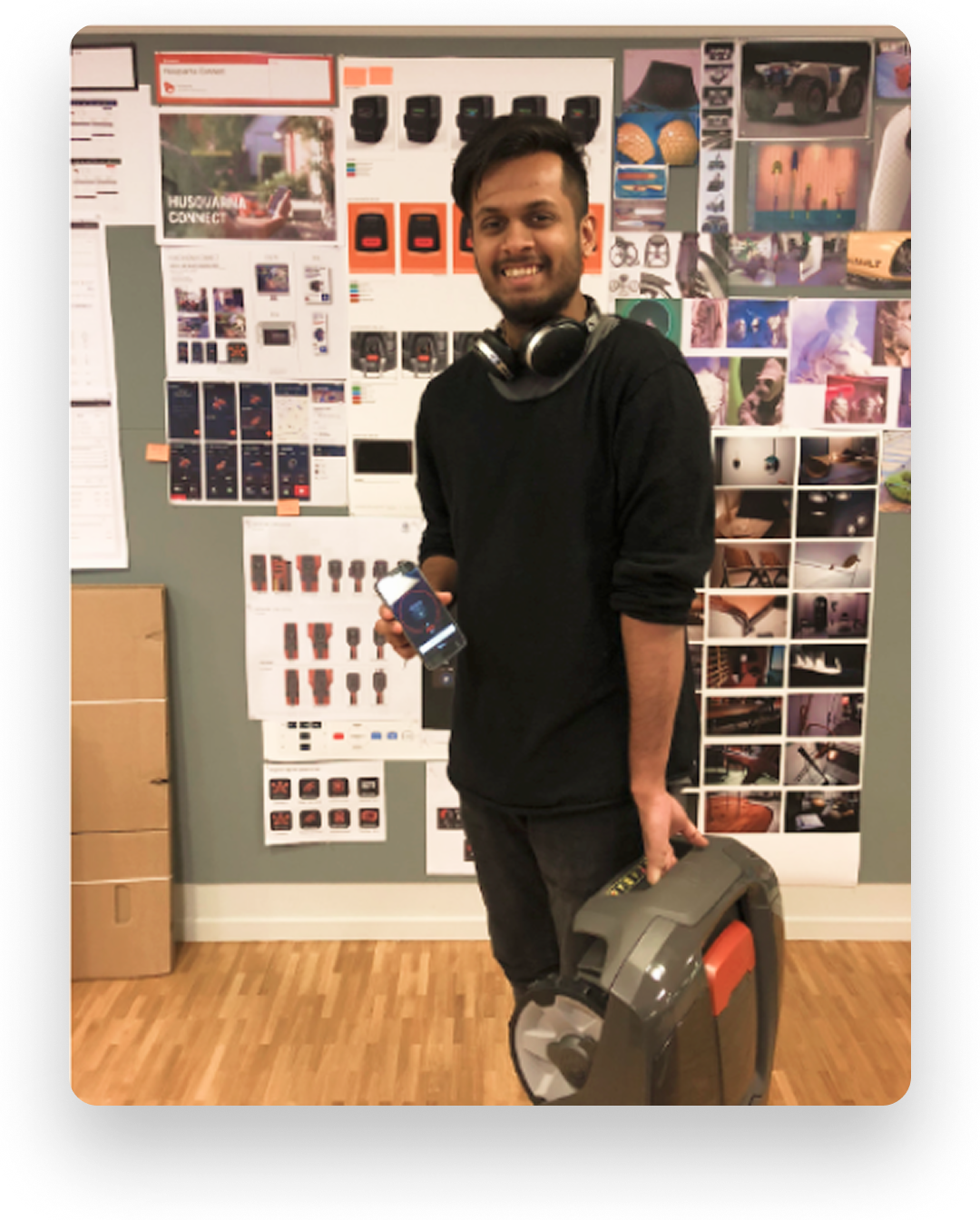
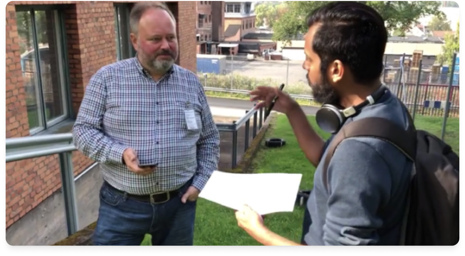
Early prototyping with the physical product
The organisation
Husqvarna operates across both consumer and professional markets, with a product portfolio spanning multiple robotic mower families, each with different capabilities, connectivity protocols, and legacy interface patterns.
The challenge was to create a shared language across hardware and software — without forcing a single lowest-common-denominator experience onto users with very different needs.
The research phase and approach
We ran stakeholder workshops across product, engineering, and sales teams to align on constraints early. Usability benchmarking covered both consumer and professional contexts, with field sessions observing how users actually interact with mowers in garden and commercial environments.
Cross-functional alignment sessions and user journey mapping formed the backbone of the research phase, feeding directly into a revised information architecture and interaction model.
Fragmented Ecosystem
Multiple product models with differing capabilities and legacy interfaces.
Physical vs. Digital
HMI and mobile app needed to feel like one system despite different constraints.
Environmental Factors
Outdoor usage introduced visibility, weather, and safety constraints.
User Variance
Interfaces had to work for both novice homeowners and experienced professionals.
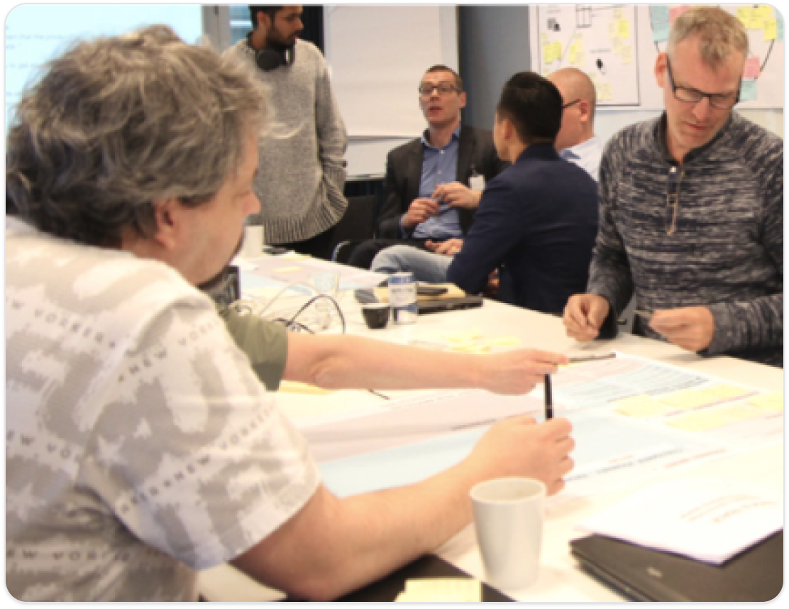
Product Workshops
Collaborative sessions with engineering, product, and field teams to surface constraints and align on design direction early in the process.
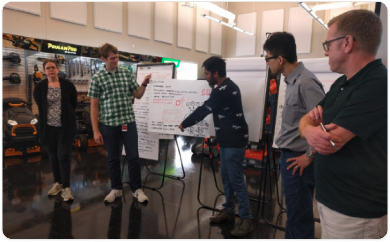
Cross-functional workshops in US showroom environments
Cross-Functional Alignment
Stakeholder sessions to surface technical constraints and business priorities.
User Journey Mapping
End-to-end flows mapped with real user data from field and usability sessions.
Field Usability Testing
On-site observation of professional users and homeowners with live product.
Information Architecture
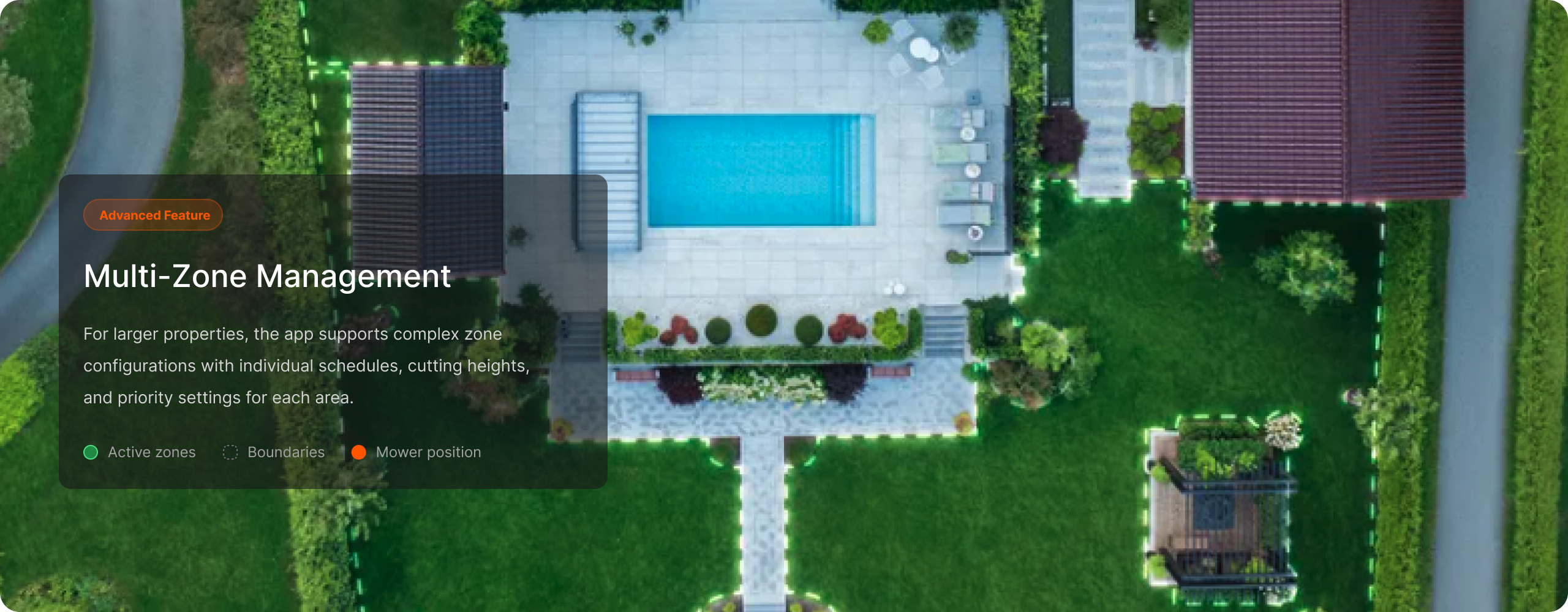
A restructured navigation model that works consistently across the app and the physical display, reducing cognitive switching between surfaces.
Visual Design & Design System
High-contrast components designed for legibility in direct sunlight, with a design system that scales across mobile, tablet, and physical HMI surfaces.
Create a shared interaction language across hardware and software
Reduce cognitive load during setup and daily use
Ensure clarity and safety in outdoor conditions
Design for long product lifecycles and scalability
HMI Design
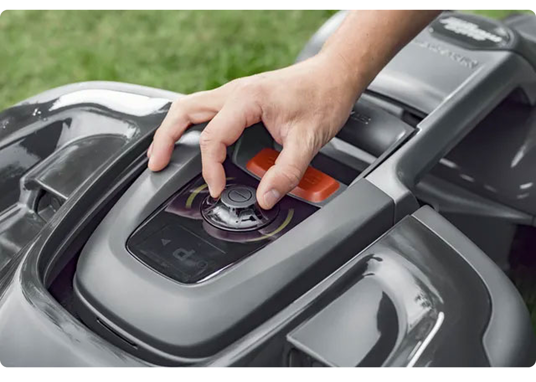
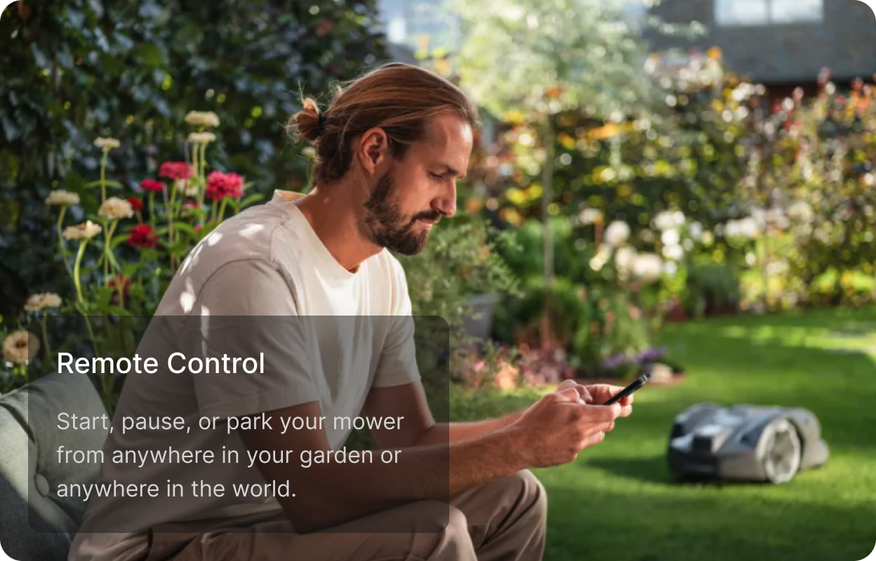
Tactile Controls — Park and Pause stay accessible via large, distinct buttons usable even with garden gloves.
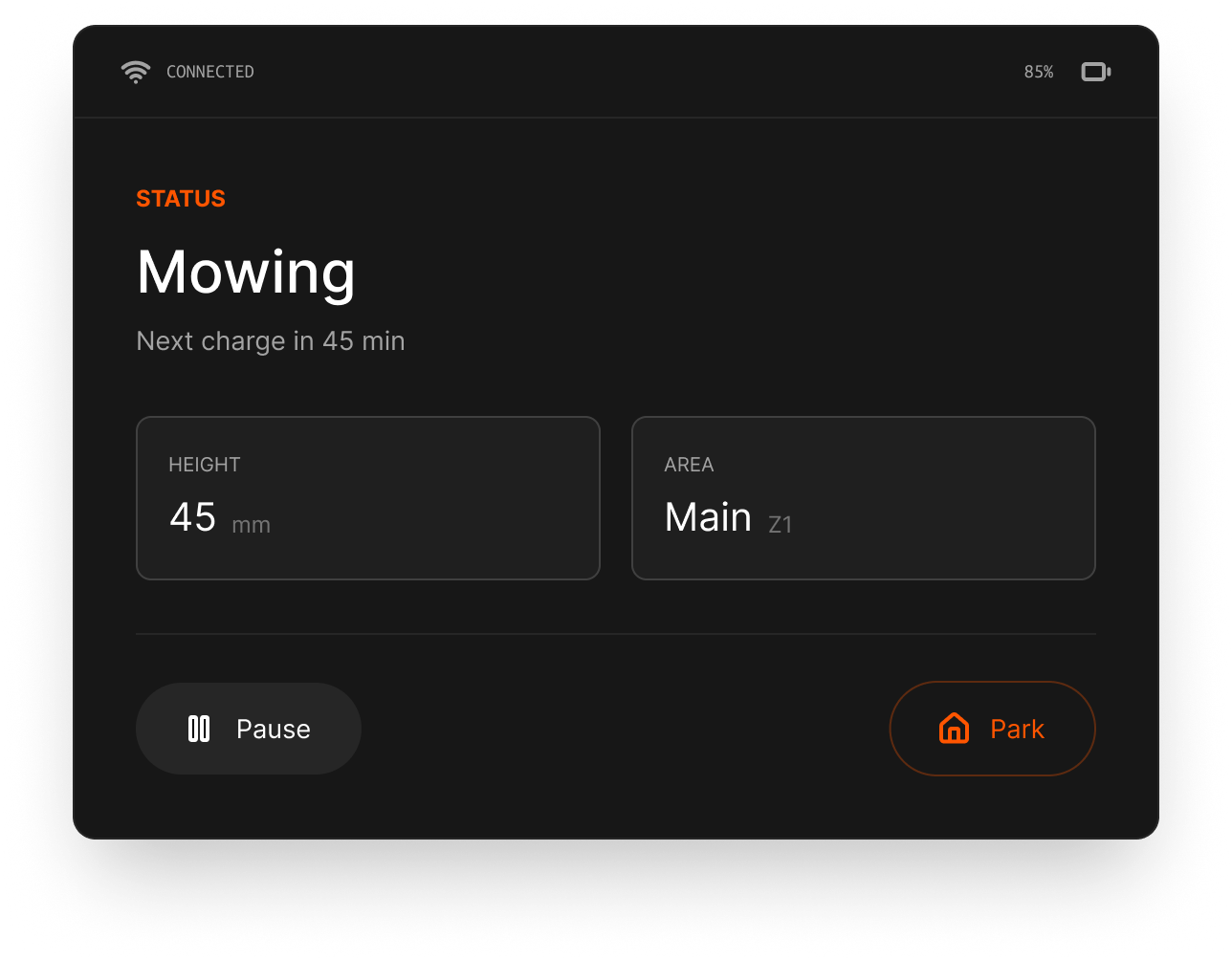
Glanceable Status — the primary view focuses on the single most important thing: what the mower is doing right now. Battery and height sit below.
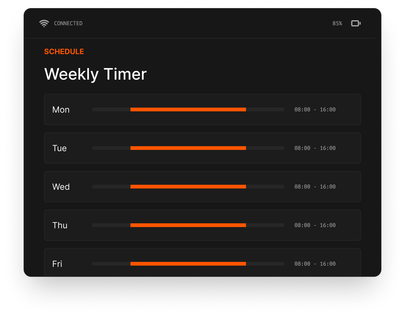
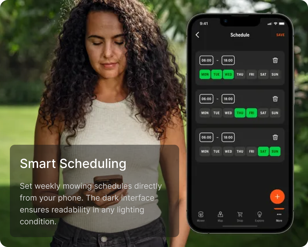
Complex Input Simplification — scheduling is visualised linearly so daily patterns are obvious at a glance.
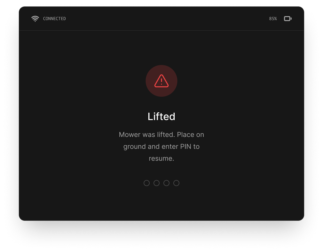
Clear Error States — distinct iconography and plain instructions guide resolution.
Companion App
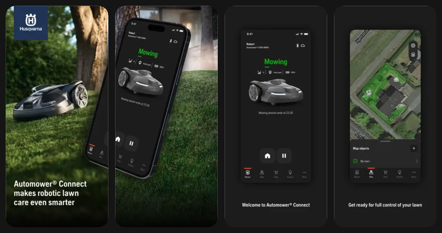
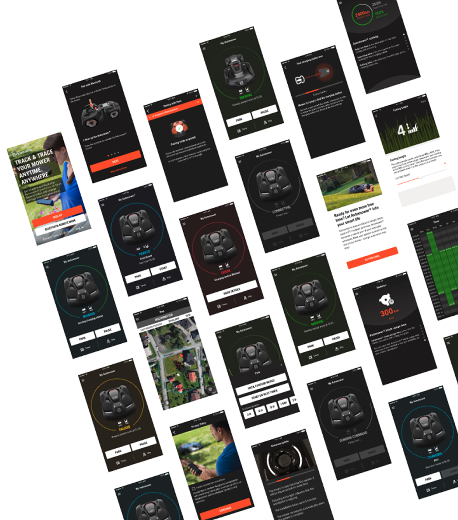
App Experience in the Real World
Product Benchmarking
Systematic evaluation of competitor apps and physical interfaces across key dimensions — discoverability, error recovery, onboarding friction, and accessibility in outdoor conditions.
Benchmarking matrix — competitor landscape across UX quality dimensions
Usability Testing
Testing approach
Both moderated and unmoderated sessions were conducted across consumer and professional user segments. Scenarios covered first-time setup, daily mowing tasks, and edge-case error states.
Field sessions introduced real environmental variables — sunlight intensity, gloved operation, and partial attention — that lab testing alone couldn't surface.
Key findings
- Onboarding drop-off reduced significantly after terminology simplification
- Glove-compatible touch targets required minimum 44px across all interactive elements
- Status visibility on the HMI was the single highest-impact usability improvement
- Professional users demanded more data density; consumers preferred simplified views
Testing in the actual environment with real users — field sessions in consumer garden settings
Process Design
The end-to-end design process was documented as a repeatable system — enabling the team to onboard new product families without starting from scratch.
Results & Conclusions
What worked
Early cross-functional alignment avoided costly late-stage design pivots. The shared token system made it possible to iterate rapidly across surfaces without breaking consistency.
Field usability sessions proved essential — outdoor edge cases that no lab test would have surfaced became the highest-impact fixes.
What I'd change
Earlier involvement of professional users in the research phase would have accelerated the dual-persona IA decision. The initial approach optimised too heavily for consumer simplicity.
More rapid prototyping with the physical product earlier in the process would have reduced the number of HMI design iterations in later stages.