
Consumer product · Global travel
Making eSIM installation
feel recoverable
I redesigned core Airalo journeys across app and web, with installation confidence as the central problem and localisation and shared patterns as the system that supported it.
Relevant for: Growth UX · Design systems · Consumer apps at scale
- Role
- Senior Product Designer
- Period
- 2023–2024
- Platforms
- Web · iOS · Android · iPad
- Company context
- Airalo grew from 6M to 20M+ users
01 · Problem and decisions
Installation anxiety was the conversion problem underneath the interface
Buying an eSIM is easy to explain; trusting that it will work after landing is harder. Technical language, platform-specific setup and weak recovery cues made installation feel risky. At the same time, platform drift, USD-only pricing and package selection added friction around the same moment of trust.
01
Reassure before instructing
Use plain language, visual steps and visible progress before asking users to change device settings.
02
Localise trust
Treat currency, language and right-to-left layout as product behaviour—not final-mile formatting.
03
Share the pattern, respect the platform
Align the journey across web, iOS and Android while keeping native conventions intact.
02 · Installation flow
From technical setup to guided confidence
The flow separates preparation, device action and confirmation. Each step says what will happen, uses a visual cue and ends with a state that confirms the user is still on the right path.
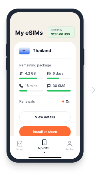
01
Know what is active
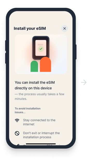
02
Follow one device step
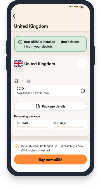
03
Confirm and continue
03 · Shared core experience
Confidence starts before installation
Onboarding, package discovery and detail views were aligned around the same hierarchy: clear value, understandable coverage and pricing, then a visible next action.
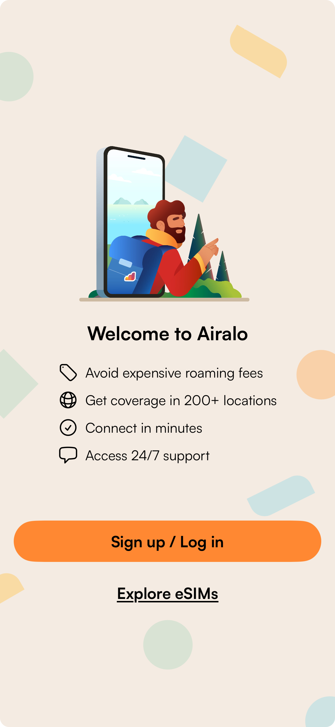
Onboarding
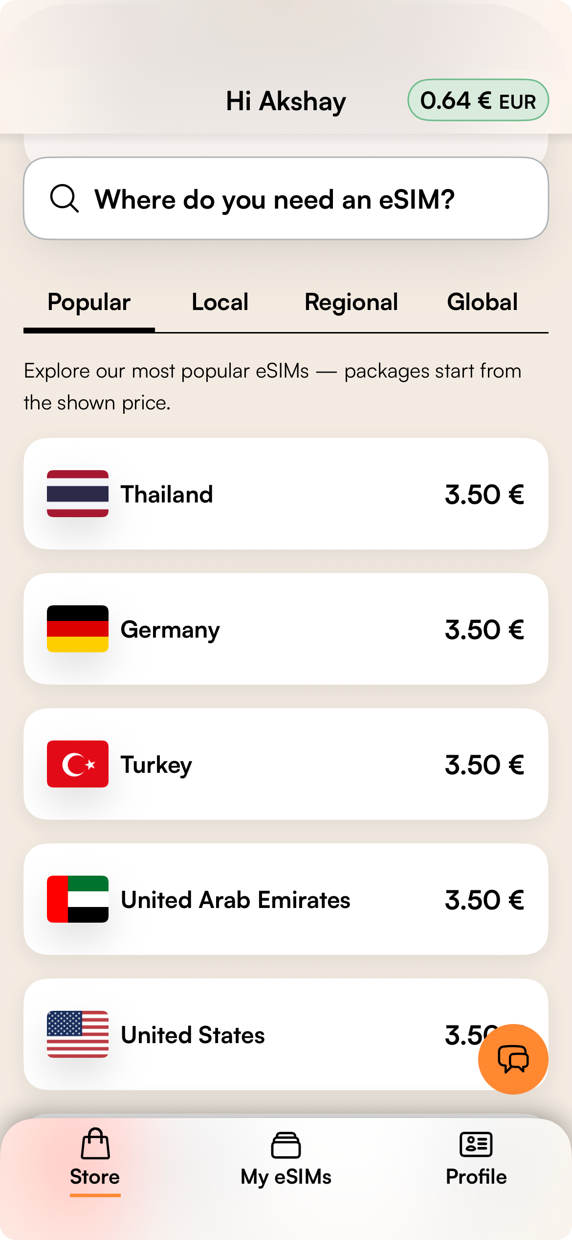
Store
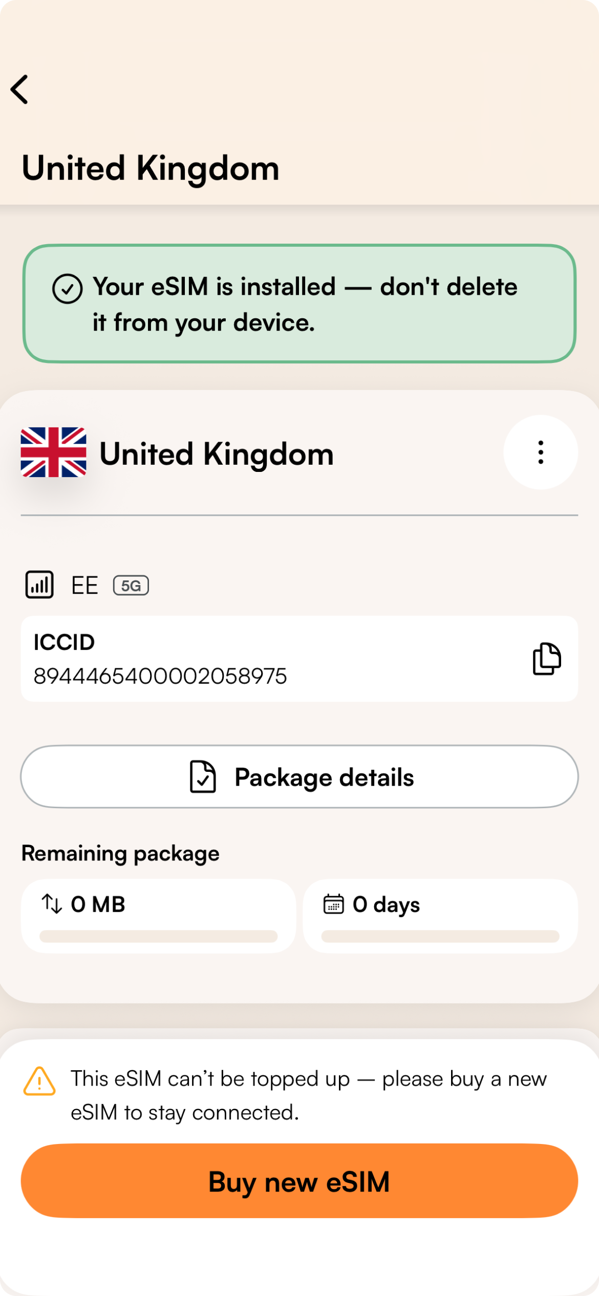
eSIM detail
04 · Web education
Explain the model before asking for a purchase
One web example carries the same reassurance into the discovery channel. The page explains what an eSIM is, checks device compatibility and turns setup into three memorable steps.
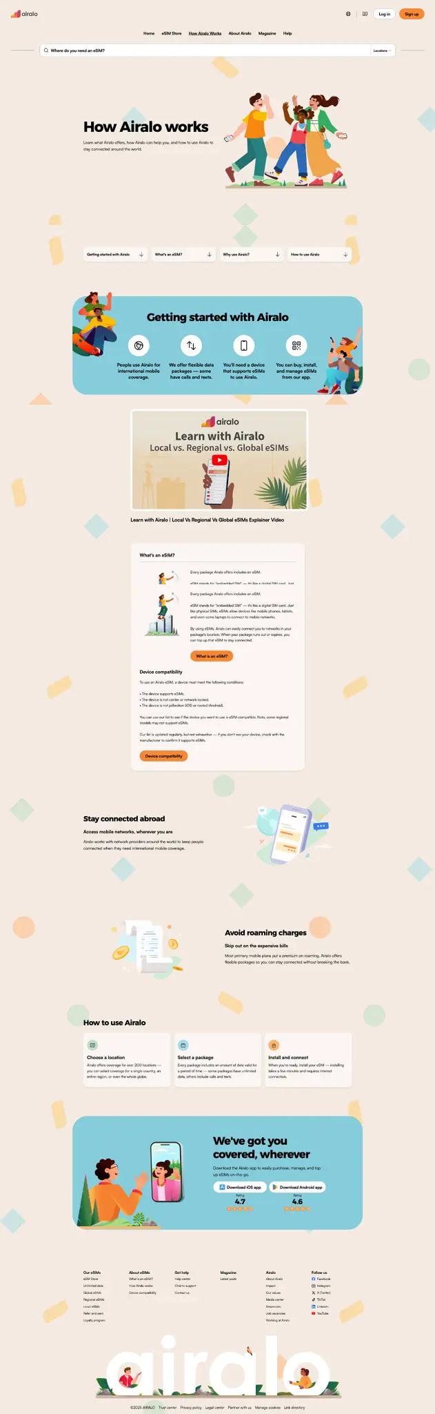
Art-directed crop of the education page; the full-page screenshot is no longer shrunk into an unreadable board.
05 · Localisation and system
Built for many markets without flattening the platform
Regional currencies, long translations and right-to-left layouts were designed into reusable patterns. The system aligned the critical journey across platforms while leaving room for native navigation and device setup.
190+ countries
Company coverage context
30+ currencies
Localised pricing context
Shared hierarchy
The same decision order across app and web.
Native behaviour
Platform conventions preserved where they reduced effort.
Accessible defaults
Contrast, typography and touch targets checked in reusable patterns.
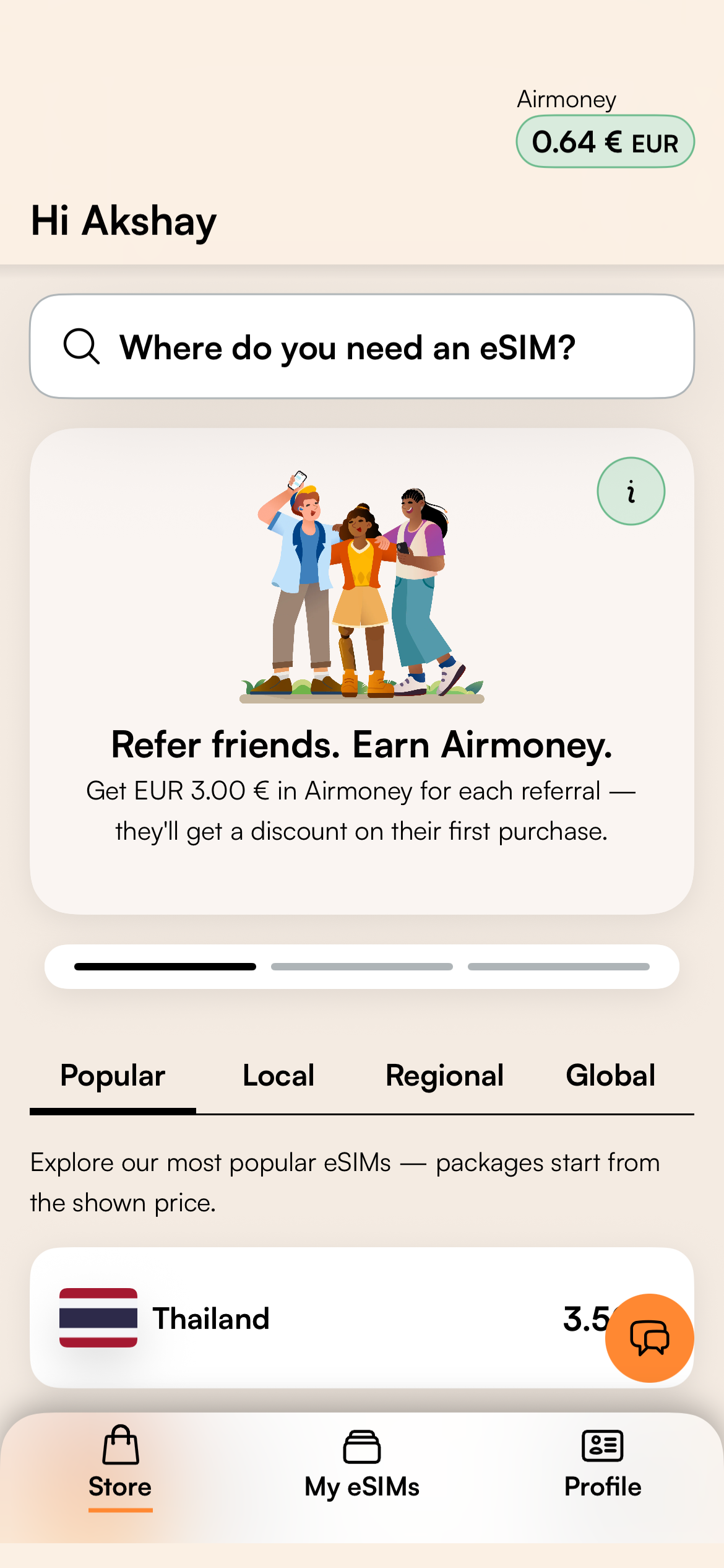
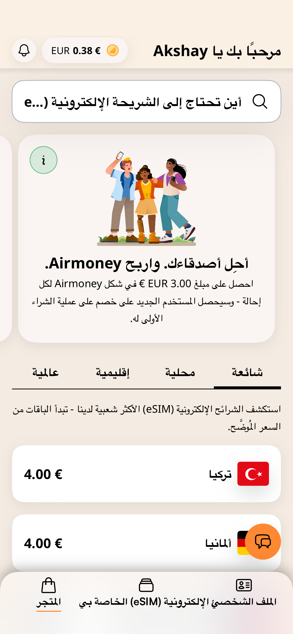

Market-specific store examples show language, direction and regional package context.
06 · Contribution and evidence
A clearer journey inside a fast-growing product
I contributed core app and web flows, installation guidance, localisation patterns and cross-platform system work. Key flows were validated through experiments with the wider product team and informed later product and design-system decisions.
What the numbers mean
Airalo's growth from 6M to 20M+ users is company context during my time there—not a design outcome attributed to this work. No conversion, activation or installation-completion metric is claimed here.